TROPICAL-TRIBE
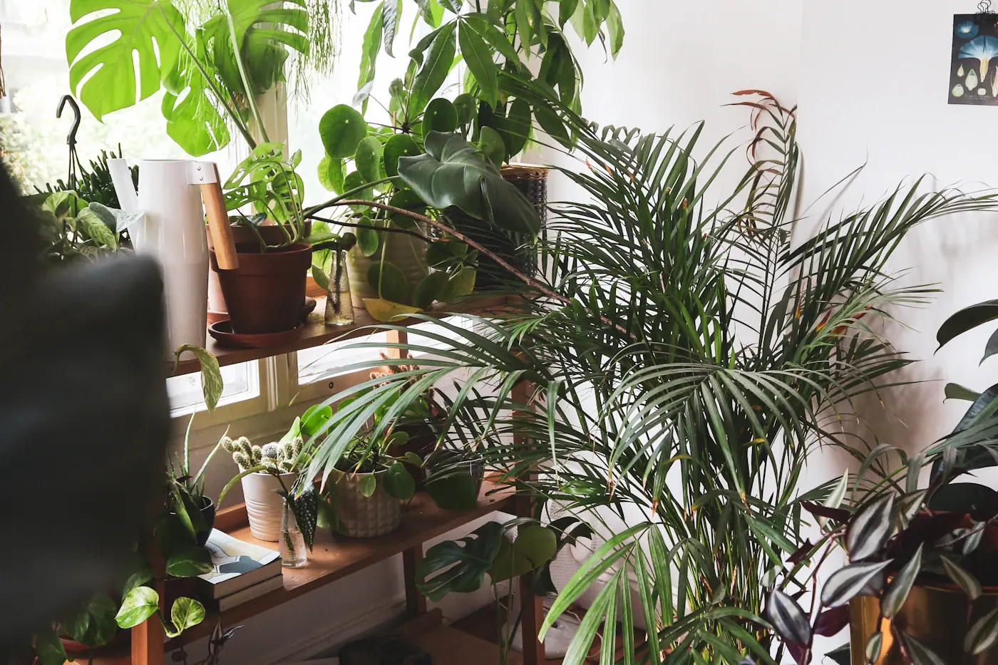
The most convincing tropical room rarely announces its theme. It might contain a muted green chair, a warm white wall, a textured basket, and an unobstructed patch of daylight. Together these elements recall a shaded veranda or a quiet coastal house, yet each remains useful in an ordinary home. The goal is not to reproduce a vacation photograph indoors. It is to notice what made that photograph appealing and translate those relationships into a room you can actually inhabit.
Color is especially useful for this translation because it works at different scales. A large pale surface can suggest brightness without a single coastal ornament. A deep green cushion can lend weight to a neutral sofa. A small clay-colored bowl can introduce warmth that prevents pale blue and white from feeling chilly. When the palette already carries the atmosphere, you need fewer decorative objects to explain the idea.
Begin with the room that already exists
Before choosing a new color, record the colors you cannot easily change. Flooring, large upholstery, kitchen cabinets visible from the living area, and window frames all belong on this list. A rented apartment with gray carpeting starts from a different position than a house with honey-colored wood floors. Neither is a problem. The difficulty begins when a new palette pretends these existing surfaces are absent.
Take photographs in daylight and after dark, then make a short inventory using plain descriptions: warm brown floor, cool gray sofa, cream wall, dark metal legs. These labels are more useful initially than precise paint names. They reveal whether the room already leans warm or cool and where a linking color might help. A soft olive can connect warm wood with a cooler sofa, while a sandy textile might soften the contrast between white walls and dark furniture.
Keep practical limitations on the same page. Perhaps the sofa cover must be washable, wall painting is prohibited, or a shared room needs to accommodate several tastes. These conditions do not reduce the possibility of a coherent design. They prevent a visually attractive plan from depending on materials or changes that will never survive daily use.
Read a landscape for relationships
Choose one photograph that genuinely interests you, whether it is your own image or a picture you can legally view as inspiration. Avoid collecting twenty unrelated tropical scenes. A beach at noon, a forest after rain, and a sunset harbor may all be beautiful, but their color relationships are very different. One image provides a manageable starting point.
Look past the named objects. Instead of writing turquoise ocean, palm tree, and sand, write broad pale area, medium green area, narrow dark shape, and one warm accent. Notice which colors occupy the most space and which appear only briefly. This observation helps you avoid the common mistake of giving every attractive color equal importance in the room.
You might decide that the landscape's appeal comes from pale surroundings with dark leafy contrast. That does not require blue upholstery or seashell decorations. Warm white curtains, a dark green cushion, and a simple wood table could express the same relationship. The room becomes an interpretation of a place rather than a set built to resemble it.
Give each color a job
A useful palette has roles. The background supports everyday life, the middle color connects furniture and textiles, and the accent creates a point of interest. These are flexible categories, not a mathematical formula. Assigning them helps you decide what belongs on a large surface and what should remain a small detail.
For a light room, the background might be ivory, pale oatmeal, or a softened white already present on the walls. The connecting color could be muted green, weathered blue, or warm tan. An accent might be terracotta, deep teal, or an earthy yellow. You do not need all of these. Select one route that works with the fixed colors rather than building a sample collection.
Allow dark elements to remain. A tropical palette does not have to bleach every object into beige. A dark picture frame, lamp base, or chair leg can give light surroundings definition. If your existing furniture is dark, repeat that tone in one other modest element so it feels considered. Repetition can integrate an awkward piece without replacing it.
Test color where it will live
A small swatch viewed under store lighting cannot describe how a color will behave beside your sofa at dusk. Use a larger sample whenever practical and place it where the finished material would sit. A cushion candidate belongs on the sofa, not held vertically against the kitchen wall. A curtain sample should be viewed with daylight behind it as well as in front of it.
Compare the sample with your fixed surfaces. Does a pale fabric make the existing wall look unexpectedly yellow? Does a green sample turn nearly black under the evening lamp? Neither effect is automatically wrong, but it should be intentional. Observe rather than trying to force the sample to match the image you first imagined.
Test one or two possibilities at a time. Too many alternatives create a room full of competing evidence. Take a photograph, remove the samples, and look again the next day. The goal is a color that belongs in your actual setting across the hours when you use it, not a perfect match to a screen image.
Let texture carry some of the atmosphere
When every surface has a printed motif, a room can feel busy even with a restrained palette. Texture offers another way to create interest. A plain woven cushion, a smooth ceramic vessel, and a softly folded cotton throw can differ noticeably while remaining within the same small family of colors.
Think about the distance from which a material is seen. A subtle weave may disappear across a large room but look rich beside a reading chair. A bold botanical print may be pleasant on one cushion yet overwhelming across full-length curtains. Scale changes the effect of the same pattern, so choose the application before committing to the fabric.
Natural-looking texture is not evidence of environmental virtue. Select materials for their documented composition, usefulness, and care requirements rather than assuming that a rough surface is automatically responsible. An existing synthetic cushion that works well may be more sensible to keep than an unnecessary new purchase made solely to achieve a certain visual vocabulary.
Use botanical pattern as punctuation
Leaf patterns can be beautiful, but they are most effective when they have room around them. Choose one main patterned element and let nearby surfaces remain relatively quiet. A botanical artwork above a plain sofa is easier to read than that same artwork surrounded by patterned cushions, leaf curtains, and a printed rug.
Consider the character of the drawing. A delicate line illustration, a photographic print, and a large painted leaf produce different moods even when all are green. Match the character to the room's existing objects. A simple botanical study may sit comfortably with books and collected pottery; an oversized graphic print may suit a room with clean furniture shapes.
Do not make every object participate. A favorite red book, a family photograph, or a useful blue mug can remain without matching the palette. A home should accommodate evidence of life. The palette is a framework for major decisions, not a rule that requires you to disguise every possession.
A worked example in a small apartment
Imagine a hypothetical living room with cream walls, a charcoal sofa, oak-effect flooring, and one large window. The owner wants a tropical feeling but cannot paint and does not want to replace furniture. The starting mistake would be to buy several bright green accessories and expect them to overpower the existing room.
A more coherent approach begins with a pale textured throw already owned, placed along part of the sofa to soften its dark mass. One olive cushion links the sofa to the warm floor. A plain clay-colored bowl on the coffee table supplies a small warm accent. A single leafy artwork replaces several unrelated small prints, while a plant is considered only if the available light suits it.
The room still contains charcoal, cream, and oak tones. Those colors have not been erased; they have been connected. The tropical reference comes through the relationship between pale light, green, warm earth, and texture. This approach also creates a clear stopping point. Once those relationships are present, additional palm-shaped objects would add explanation without adding much function.
Edit objects by usefulness and meaning
Place decorative objects from one surface together and look at the empty space they leave. Then return only the pieces that contribute something specific: a place to set keys, a vessel used for flowers, a photograph that matters, a lamp that makes reading possible. An object does not need to be practical if it is meaningful, but it should earn its space in some recognizable way.
Grouping can make a small collection feel quieter. Three related objects on one tray may read as a single arrangement rather than three unrelated interruptions. However, the tray itself is not a solution if it simply becomes a container for miscellaneous clutter. Give the group a purpose and keep enough surrounding surface free for actual use.
Try a temporary holding box for uncertain items. Put them away for a week rather than discarding them during a burst of enthusiasm. If the room feels easier to use and you do not miss them, consider another location or an appropriate donation. Editing should be reversible while you learn what the space needs.
Solve common palette problems directly
If the room feels flat, do not immediately add another color. Check whether every surface has the same lightness. A darker cushion or frame may create enough contrast. Alternatively, the room may need a difference in texture rather than hue. A smooth table beside woven fabric can bring definition without expanding the palette.
If the room feels overly themed, remove the most literal object first. A sign naming the beach, a cluster of shells, or several novelty-shaped accessories may be doing more storytelling than the room needs. Keep one personally meaningful piece and let the palette do the rest. The effect is often more convincing when the reference becomes less explicit.
If the colors clash, compare their undertones with the largest fixed surface. A pinkish beige textile beside a yellowish floor may feel uneasy even though both are called neutral. You might resolve this with a linking middle color or by moving the textile elsewhere. Buying more decorative pieces usually makes this kind of mismatch harder to understand.
Make a purchase list only after the edit
Write the function of any missing item before describing its appearance. You may need a washable sofa cover, a lamp for an unlit corner, or a larger cushion that supports your back. Once the function is clear, the palette can guide the choice. This order keeps the room from accumulating beautiful objects that solve no real problem.
Distinguish necessary purchases from optional refinements. A curtain that improves privacy may be worth prioritizing; a second decorative bowl can wait. Set aside images of potential items and revisit them after living with the revised room. If an object no longer seems necessary once the surfaces are edited, the delay has been useful.
Keep measurements and care needs beside the list. A pale rug that cannot handle the household's daily traffic may undermine the entire plan. The most successful color is one you can comfortably maintain, and the most successful accessory is one that leaves enough room for ordinary activities.
Let shared rooms reflect more than one person
If several people use the room, ask each person which existing object or color they most want to retain. Begin with those preferences rather than presenting a finished scheme for approval. A partner's dark blue chair or a child's colorful drawing can become part of the composition instead of an inconvenience to hide. The room will feel more settled when its inhabitants recognize themselves in it.
Use the quieter background to accommodate those differences. A restrained foundation can hold several personal details without appearing chaotic. Agreement about clear walking paths, useful surfaces, and comfortable seating is often more valuable than agreement about every accent color.
Keep the palette flexible through the year
A restrained tropical room can adapt without a complete seasonal transformation. In warmer months, you might remove an extra throw and leave a table more open. In cooler months, a deeper green textile or warmer lamp light can sit within the same framework. The foundational colors do not need to change every time the weather does.
Store small accents together so they can be rotated deliberately rather than layered indefinitely. Bring out a favorite bowl or print because you want to see it again, not because a season requires a shopping trip. Familiar objects often gain presence when they return to an uncluttered setting after an absence.
The final test is simple: sit in the room doing something ordinary. Read, talk, fold laundry, or drink a cup of tea. If the atmosphere supports that activity and the surfaces remain useful, the palette is doing its job. Tropical style becomes most appealing when it feels like a place to live rather than a theme to maintain.